Tuesday, August 4, 2009

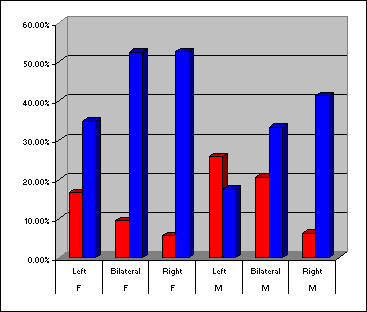
Bilateral Graph


This image can be found at: neuropolitics.org/defaultmay06.asp

Lorenz Curve


This image can be found at: planning.gov.mv/hies/cover.htm

Index Value Plot


This image can be found at: www.galatime.com/.../

DOQQ Map


This image can be found at: www.lacoast.gov/maps/2004doqq/index.htm

DEM


This image can be found at: www.emporia.edu/.../alvarez1/551proj.html

DLG


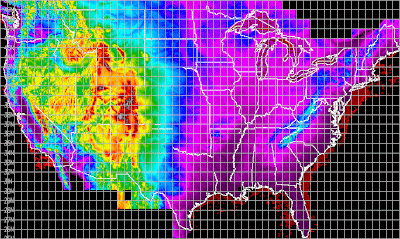
This image can be found at: weather.unisys.com/usgs/3sec/index.html

DRG Map


Isopleths


Isopachs

This image can be found at: www.kgs.ku.edu/PRS/Coal/riverton.html

Isohyets


Isotachs


This image can be found at: www.ssec.wisc.edu/media/April2003.html

Isobars


This image can be found at: www.solcomhouse.com/windpower.htm

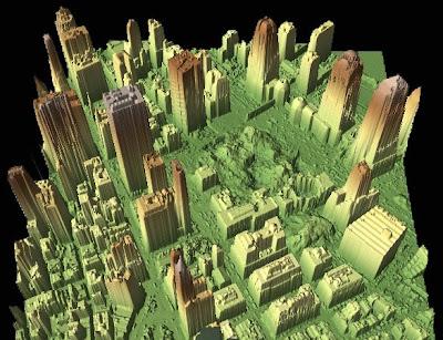
LIDAR


This image can be found at: http://imaging.geocomm.com/gallery/
This is a map of LIDAR images of ground zero rendered Sept. 27, 2001. This is also an aerial photo of New York.

Doppler Radar

This image can be found at:

Infrared Aerial Photo


Cartograms


This image can be found at: www.ribbonfarm.com/.../

Isoline Maps

This image can be found at: www.unu.edu/.../unupbooks/80157e/80157E09.htm

Proportional Circle Maps


(Scroll all the way down)

Choropleth Map


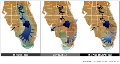
Flow Map

This image can be found at: evergladesplan.org/.../requested_downloads.aspx

The map shows the current flow of water through the Everglades. It also shows the past water flow and future predictions.

Box Plot


This image can be found at: www.xfy.com/.../1.4/spec/spec_chart.html

Climograph


This image can be found at: www2.volstate.edu/kbell/climographs.htm

Population Profile


This image can be found at: www.pillarsoftruth.com/TheEnd.aspx
(Under "Maps")

Correlation Matrix


This image can be found at: www.journalofvision.org/4/4/9/article.aspx

Similarity Matrix


This image can be found at: cgi.mtc.sri.com/Cluster-Lab/

Windrose

This image can be found at: www.pixmac.com/.../000000184705

Parallel Coordinate Graph


This image can be found at: vis.lbl.gov/Events/SC07/Drosophila/

Triangular Plot


Histogram


(Example 8 3D Histograms)

Stem and Leaf Plot


Scatter Plot


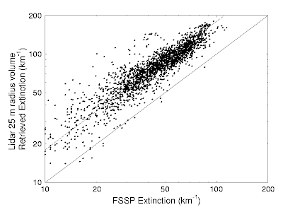
This is a scatter plot of the Lidar 2004 Flight Results and shows the lidar retrieved extinction versus the FSSP derived extinction. The linear correlation in extinction of the points is 0.915. This scatter plot concludes that the linear correlation is high.

Star Plot


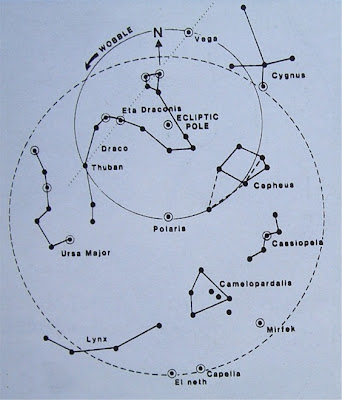
This is a Star Plot of the Northern night sky. Polaris, the northern star, is located at the center of the map. The Star Plot shows a layout of the constilations surrounding Polaris.

Black and White Aerial Photo

This image can be found at: digitalcommons.bryant.edu/hist_photos/4/

This is a Black and White Aerial Photo of the Bryant University campus. In this aerial shot you can see the Unistructure, gym, parking lots, dorms and Stump Pond.

Statistical Map
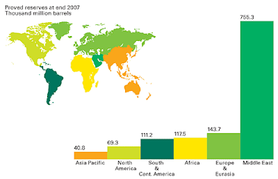

This image can be found at: whatilearnd.com/post/38167638/world-oil-reserves

Any kind of data that can be expressed numerically and varies in quantity from place to place can be used in Statistical maps. This is a map of the worldwide proved oil reserves as of 2007. Each numerical number represents barrels in the thousand million. The Middle East vastly holds the top number of oil reserves at 755.3 thousand million with Asia Pacific holds the least at 40.8 thousand million.

Dot Distribution Map
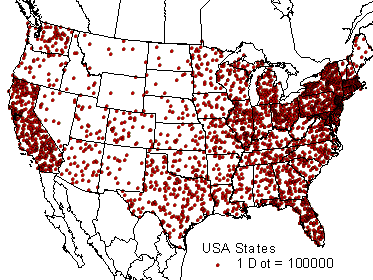
This image can be found at: hosting.soonet.ca/.../bl130lec7.html

The Dot Distribution Map uses dots to represent a value such as population. In this map of the United States, each dot represents 100,000 people.

Propaganda Map
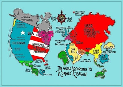
This image can be found at: kuoest.wordpress.com/

Propaganda Maps are used to persuade people to think one way or another. This map shows "The World According to Ronald Reagan" during the Cold War. This map indicates that the USSR (mostly Europe) is "Godless Communist, Liars and Spies" and that "Republicans and other Real Americans" are mostly found in the south east. These are great indicators of propaganda.

Mental Map


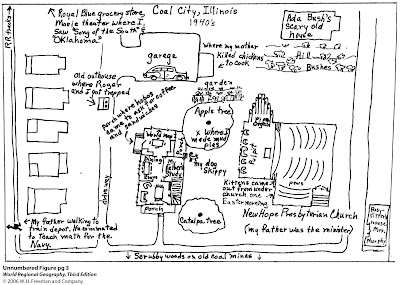
A Mental Map is one of the most basic forms of mapping. It is an individual's internalized representation of what a person knows about the locations and the characteristics of places at a variety of scales (local to global) and is usually organized in a spatial context. The above Mental map list the map illustrator's mental layout of Coal City, IL.

Hypsometric Map

This image can be found at: www.esteio.com.br/english/executed/se_leme.htm

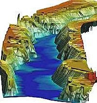
This is a 3D Hypsometric Map, which shows the different levels of relief. This type of maps helps to define the environmental potential that can be developed along the waterway.

Cadastral Map
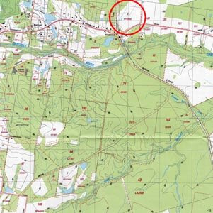


This image can be found at: www.icsm.gov.au/mapping/maps_cadastral.html (If you click on the image located at the URL site, a much larger and detailed image of the map is provided.)

A Cadastral Map commonly includes ownership and boundary details, such as survey district names, positions of existing structures, section and/or lot numbers and their respective areas, adjoining and adjacent street names and selected boundary dimensions. The above Cadastral Map idenifies individual pracels of land in relationship to each other. Additional information is also shown, such as each pracels size, who owns the land and what it is used for. The Cadastral information has been overlaid onto a Topographical map.

Topographic Map
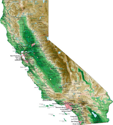

This image can be found at: www.lib.utexas.edu/.../states_sites.html
(California - Shaded Relief (Purdue University))
A topographic map characterizes areas in large-scale detail with quantitative representation of relief, a vertical dimension of land surface such as a mountain range or elevation. In the above map of California, you can see the elevation difference in the green and brown shaded areas. The brown area indicates a high elevation of mountains. The area with the darker shade of green probably indicates some form of elevation that rises higher than the areas shaded in a lighter green.

Thematic Map


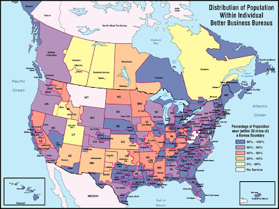
This image can be found at: www.mapsunlimited.com/sample/BBBNAmap.html
Thematic Maps protray a simular theme throughout a geographical location, such as social, political, cultural, economic, and agricultural trends. The thematic map above shows the percentage of population in each state / providence located within 30 miles of a Better Business Bureau. As you see, the population is rather high in the southern states of America. It seems as if the United States of America has a relativly high percentage of poplulation within 30 miles of a Better Business Bureau; where as, the majority of Canada's percentage seems low.

Public Land Survey System Map


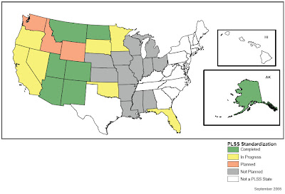
The PLSS Map is used to divide public domain lands, which are lands owned by the Federal government of the United States. The PLSS Map above subdivides the states into 5 categories indicating which states involved in PLSS Standardization. Green states have already completed the process of standardization, yellow states are currently in progress, orange states are planned, grey states have not yet been planned and white states are not listed as a PLSS State.

Planimetric Map


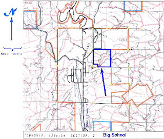
This image can be found at: realestate.potlatchcorp.com/.../REparcel23.asp

A Planimetric map indicates only the horizontal positions of features, without regard to elevation. This kind of map is also known as a line map. In the image above, the map is indicating that the Big School property is located adjacent to the Forest Service complex in Pierce, Idaho.